Top tactics to improve your user experience & boost conversion rates
- What’s UX & How does it impact your website’s conversion rates?
- Clear call-to-action (CTA) button
- What are CTA buttons?
- Implement video on your landing page
- Website Loading Speed
- Compelling CTA headlines
- Authentic images
- Is your website’s readability high?
- Language capabilities
- A/B testing
- Conclusion
What if you aren’t able to convert that huge amount of traffic into paying customers?
It’s obvious that you don’t have a strong conversion funnel in place.
Did you know that various business owners all across the world don’t quite give conversion rate optimization a thought until they face such conversion issues?
And once they are familiar with this issue, they already lose thousands of prospects.
While trying and testing out various conversion rate optimization tactics, they lose thousands more.
What if I told you that you could totally avoid this problem right from the beginning?
All you need to do is to take care of the user experience right from the very beginning.
In this blog post, we will take a look at what UX is and how it impacts your website’s conversion rate. Additionally, we will learn about some of the top proven tactics that will help you improve user experience and boost up the conversion rates.
Well, then!
Let’s dig in right away.
What’s UX & How does it impact your website’s conversion rates?
According to Wikipedia,
"UX is your audience's set of emotions as well as attitudes with respect to utilizing a product, service, or system. It includes experiential, practical, meaningful, effective, as well as valuable aspects of human-computer interaction as well as product ownership."
In short, UX is all about your consumers' experience while using your product, service, or system.
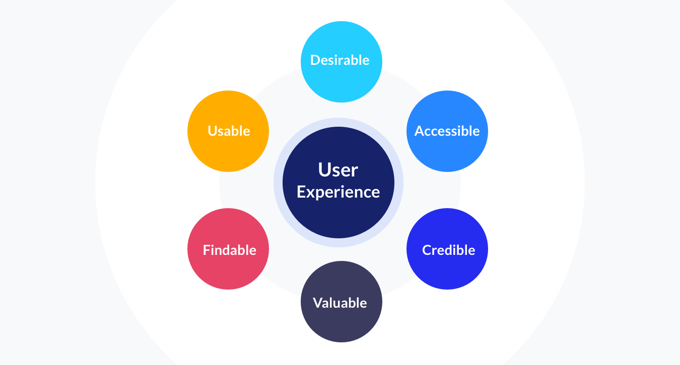
During the development phase of your website, you need to keep in mind that you put in front of them what they really want to see during their buying process.
Here’s the list of vital questions that you need to ask yourself:
- Is my website easily accessible?
- How’s the navigation?
- Can people accessing my website easily get in touch with me?
- Does my website manage to portray how my business intends to solve their problems?
In the end, your ultimate goal is to provide your prospects and customers with a unique and effective solution that fulfills their needs and ultimately solves their problem.
Right from the moment the visitor lands on your website to the moment he/she fills out the form or converts, UX plays a vital role. Now that we understand what UX is all about and the importance it holds, it’s time to take a look at how you can knock it out of the park with these top proven tactics.
Let’s begin.
1. Clear call-to-action (CTA) button
What are CTA buttons?
These are the buttons that you can implement on your website, especially on your landing page, to fulfill your conversion goal by guiding your visitors towards it.
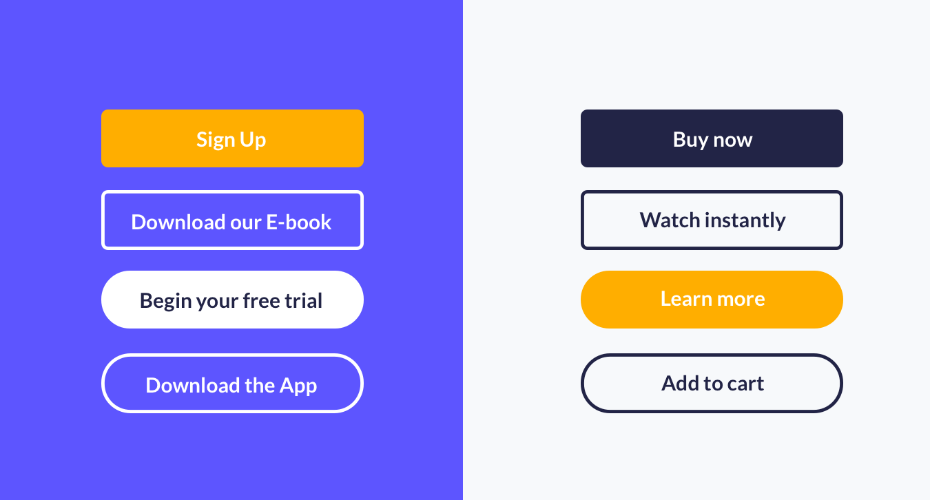
Here’s the list of the most common ones:
- Sign Up
- Download Our E-Book
- Begin Your Free Trial
- Book A Free Consultation
- Download the App
Implementing an attractive and clear CTA button will improve the user experience quite a lot.
In the past, we have witnessed the conversion rates of websites with clear and attractive CTA buttons to be higher.
That's because it leads to better user experience.

In order to begin optimizing, you should determine the action that you are optimizing for.
Here are a few points that you should keep in mind:
- CTA button color
- CTA must be action-oriented
- Keep the word count less than five words.
Once you have everything in mind, it’s time to A/B test various approaches in order to carefully understand what works the best.
2. Implement video on your landing page
Did you know that the inclusion of a video on your landing page can boost up your conversion rate by a massive 80%?
Video marketing has been one of the most trending topics in the digital marketing world for quite some time.
The video will boost up your website's conversion rates exponentially.
That's because videos help in building trust and eliciting emotions, ultimately insisting on your prospects and customers to take positive action.
Wait! This doesn’t mean that you take out your smartphone and begin shooting.
First of all, a low-quality video will do more harm than good.
And that’s exactly why you should allocate separate funds for the video production process.
Uploading high-quality videos will help you clarify your message, build trust, and elicit emotion.
3. Website Loading Speed
Did you know that the average loading speed of your website shouldn’t be more than 2-3 seconds?
And if it’s more than the average speed, then you will witness a huge bounce off rate.
That’s because nobody likes to wait.
A slow loading speed will, in turn, frustrate your visitors, making them abandon your website instantly.
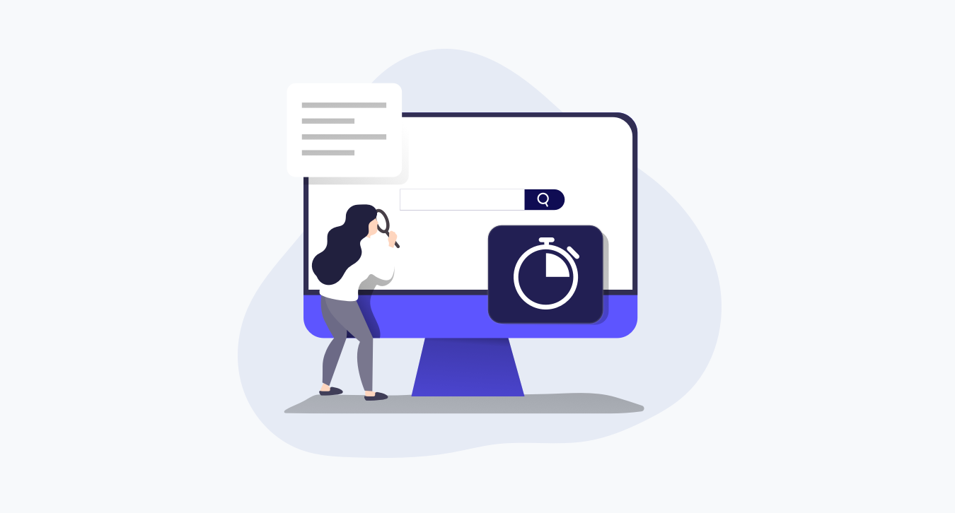
What if your website’s landing page is slow?
If that’s the case, your visitors won’t even be going past your landing page and exploring your website further.
Optimizing your website’s loading speed for desktops isn’t just enough.
With a tremendous rise in the number of mobile-users each year, it has now become more important for business owners to focus on building a mobile-friendly website.
And that’s why they need to optimize the loading speed for the mobile-users too.
There are tons of tools available all across the Internet that will help you measure your website’s loading speed.
For example, PageSpeed Insights
All you need to do is to put in your website URL, and you'll have everything right in front of you.
4. Compelling CTA headlines
A compelling CTA copy will help you boost up your conversion rate tremendously. Businesses often neglect the importance of their CTA headlines and buttons.
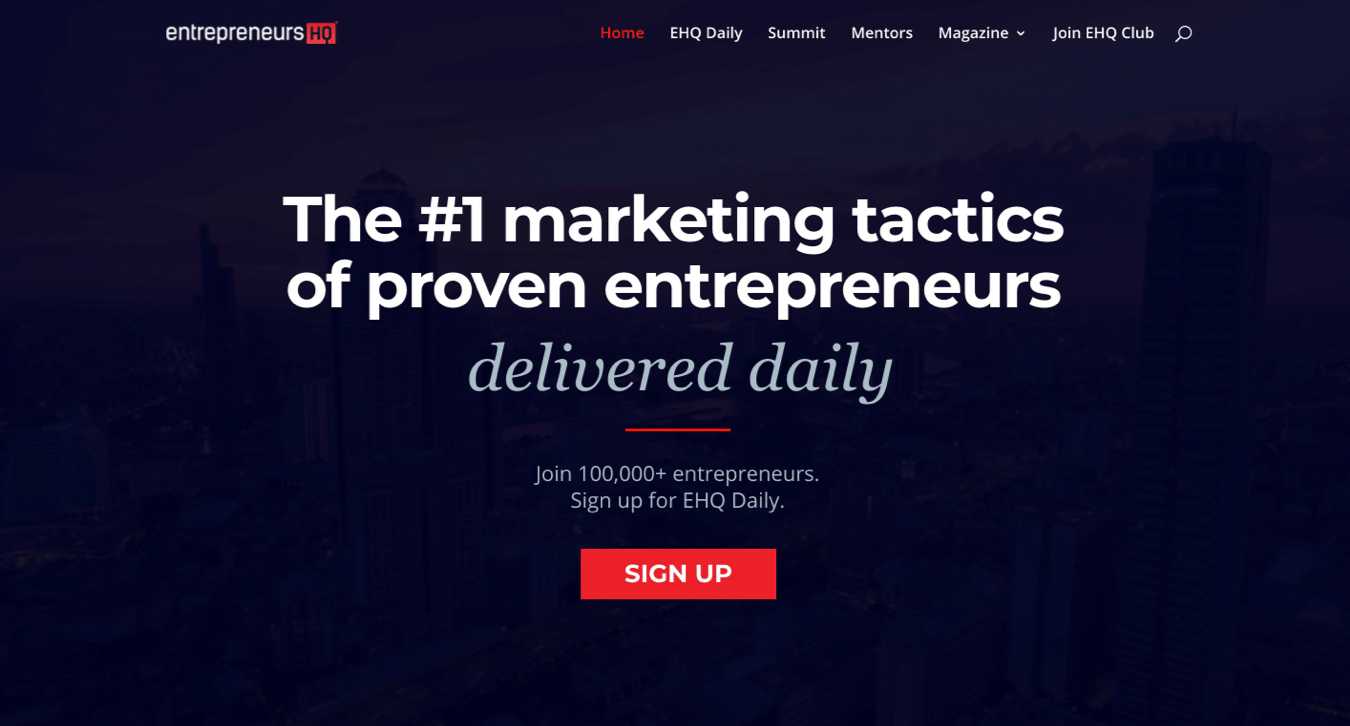
An effective headline is a perfect combination of the power words and effectively manages to create a sense of urgency, elicit emotion, and demonstrate scarcity.
For instance, which one of the following do you think sounds compelling and urgent:
“Learn How to Lose Weight”
OR
“Learn Our Magical Secret to Losing 10lbs. In Just 30 Days. Order Our Book Today By 5 P.M. To Get Free Delivery”
Definitely the latter one, right?
Here are some of the words that successfully manage to elicit emotion:
- Discover
- Learn
- Join
- Build
- Stop
- Start
5. Authentic images
Images play a major role in making your content visually appealing.
But what matters is the quality and kind of image that you choose.
It can make or break the entire look and feel of your website.
Firstly, I’d advise you to distance yourself from the stock photos.
They might be easy to use and extremely cheap. But implementing them on your website will do more harm than good.
Once your readers figure out that your website’s filled with stock photos, they will soon begin losing interest.
And that’s where original images come in.
Original images feel a lot realistic and will help you connect with your prospects and customers even more.
Using stock photos will ultimately make your visitors question your dedication to building your brand. And that’s the reason you need to stop using stock photos straight away.
6. Is your website’s readability high?
Text quantity, font size, as well as spacing can have a huge impact on the readability of your website.
If you want to boost up your website’s conversion rates, you need to make sure that your visitors understand the content on your website and are able to consume it with ease.
Here’s an example of a webpage with poor readability:
Here’s an example of a website with good readability:
Notice the difference between both of them, and you'll have a better understanding of how exactly your web pages should be.
7. Language capabilities
Quick tip: Adding an interactive audio or video chat feature and SaaS language transition will simply do wonders for your website, helping you provide a top-notch user experience. Your customers will love communicating with you in their native language, ultimately helping you build brand loyalty and credibility.
8. A/B testing
Once you have everything set up, it’s time to A/B test different areas to understand what’s working and what’s not.
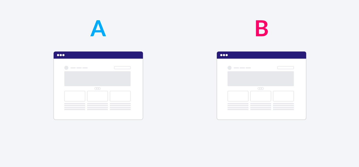
Here are a few of the things to begin with:
- Contact form position
- CTA headline text
- CTA button size
- CTA button positioning
- CTA button color
- CTA button wording
- Contact form fields
- Images, videos, and custom graphics
- Content length
- Overall page layout and design
Conclusion
In the end, good user experience isn't just about providing your visitors with useful information. Instead, you need to provide useful information in a comfortable and engaging manner.
What’s the point of your outstanding products or services if you aren’t able to place it in front of your prospects and customers effectively?
And that’s exactly why you should begin your journey towards building a website that’s engaging and provides outstanding user experience. Once that’s done, you’ll witness your conversion rate going exponentially up.